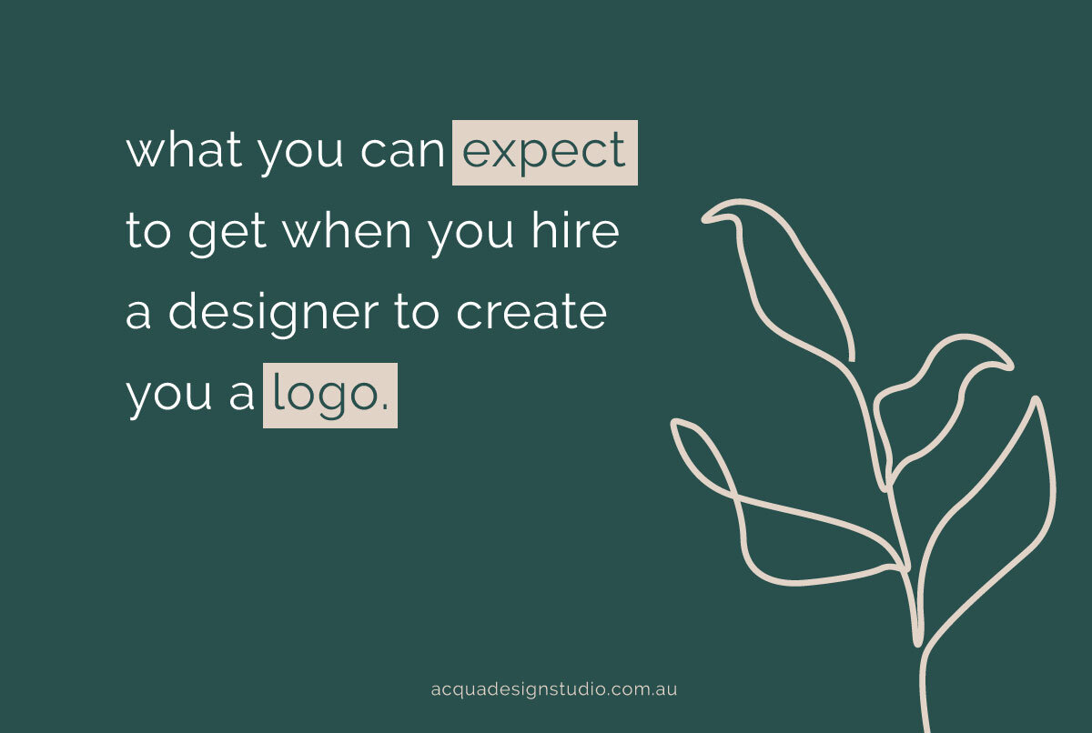
What’s in a logo?
Here’s a question.. when you hire a designer to create a new brand for you, what do you think you’ll get? Those who have never been through the process, might just think you get a logo (duh). One design, probably in jpeg, for you to use where you need. If you've been through the process, you'll know otherwise.
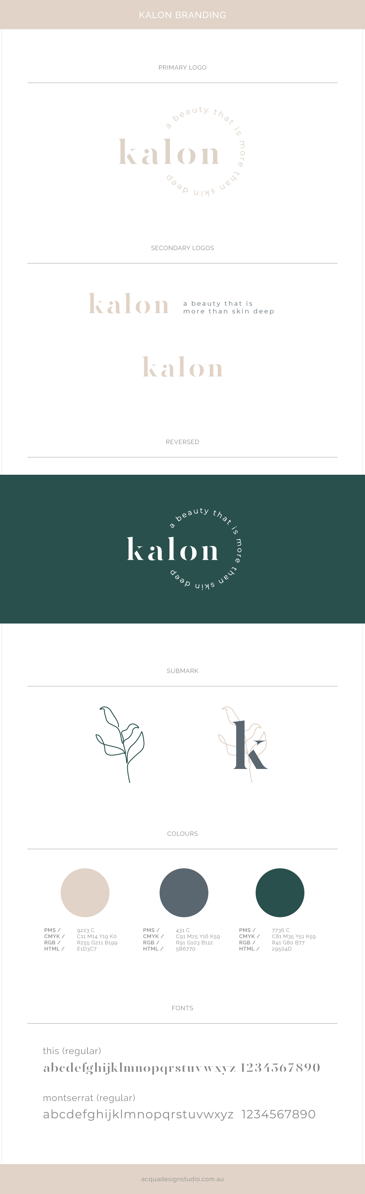
Before we get to the final logo design there's a few steps. You first go through the brief, 3-4 design concepts with which you go through a few rounds of revisions to fine tune, before you get to your final design, which actually comes with a team of other designs. These team players are usually longer or shorter versions, simplified or text-based, a submark, stamp or graphic, and a reversed logo (white). Each design serves a purpose. You’ll use your primary logo the most, with the others all having roles to play on signage, small print, websites and social media, and as watermarks or “signatures”.
THEN… each file is given to you in two categories - CMYK (for print) and RGB (for screens). As your colours can change due to the way print and screens display colours, it’s important to have each one set up correctly.
THEN… each of those files is saved into different file formats. These usually include .eps, .pdf, .jpg, and .png. They all have a purpose.
Seems like a lot hey? Cos it is. You’ll also get a style sheet which explains all this, cos we’re not mean, we spent countless hours designing this beautiful new branding, we want you make sure you use each logo file the correct way.
In some cases, I have warned my clients that I’ll be sending them 40 or 50 logo files, and to save them and store them carefully.
It might sound ridiculous, 50 logo’s, but when that quote you got said $XXXX for a logo, it kinda makes sense now, doesn’t it? And if you're thinking "but I don't need 50 logo's!", well, you might not in the beginning, but eventually you will. And isn't it better to be safe than sorry?
Below is a brand I created (fictional) to showcase how one logo can have multiple variations and submarks. The overall information provided is similar to what I give my clients, so that they can take the logo/s I’ve designed, and go fourth and create anything and everything they need for their business.